

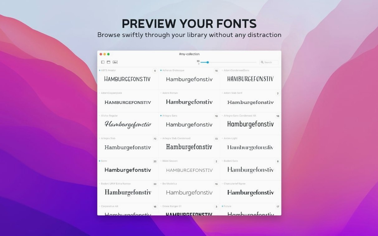
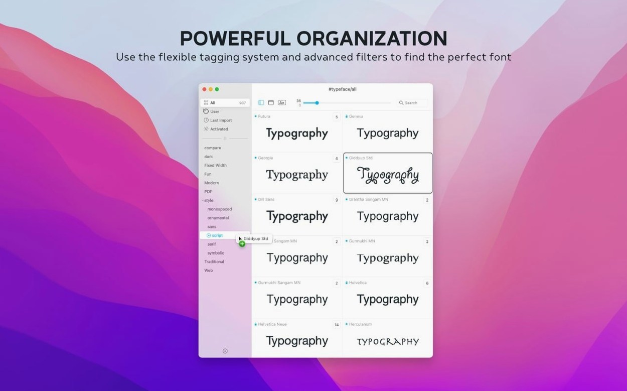
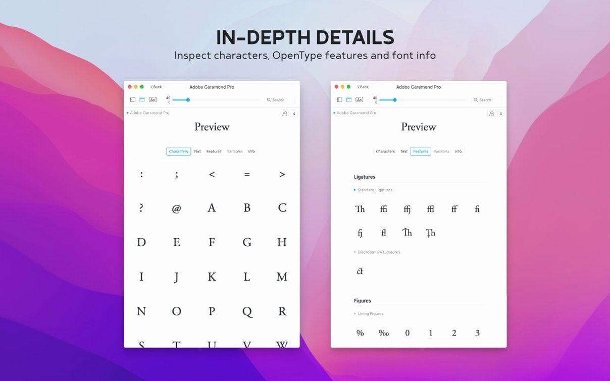
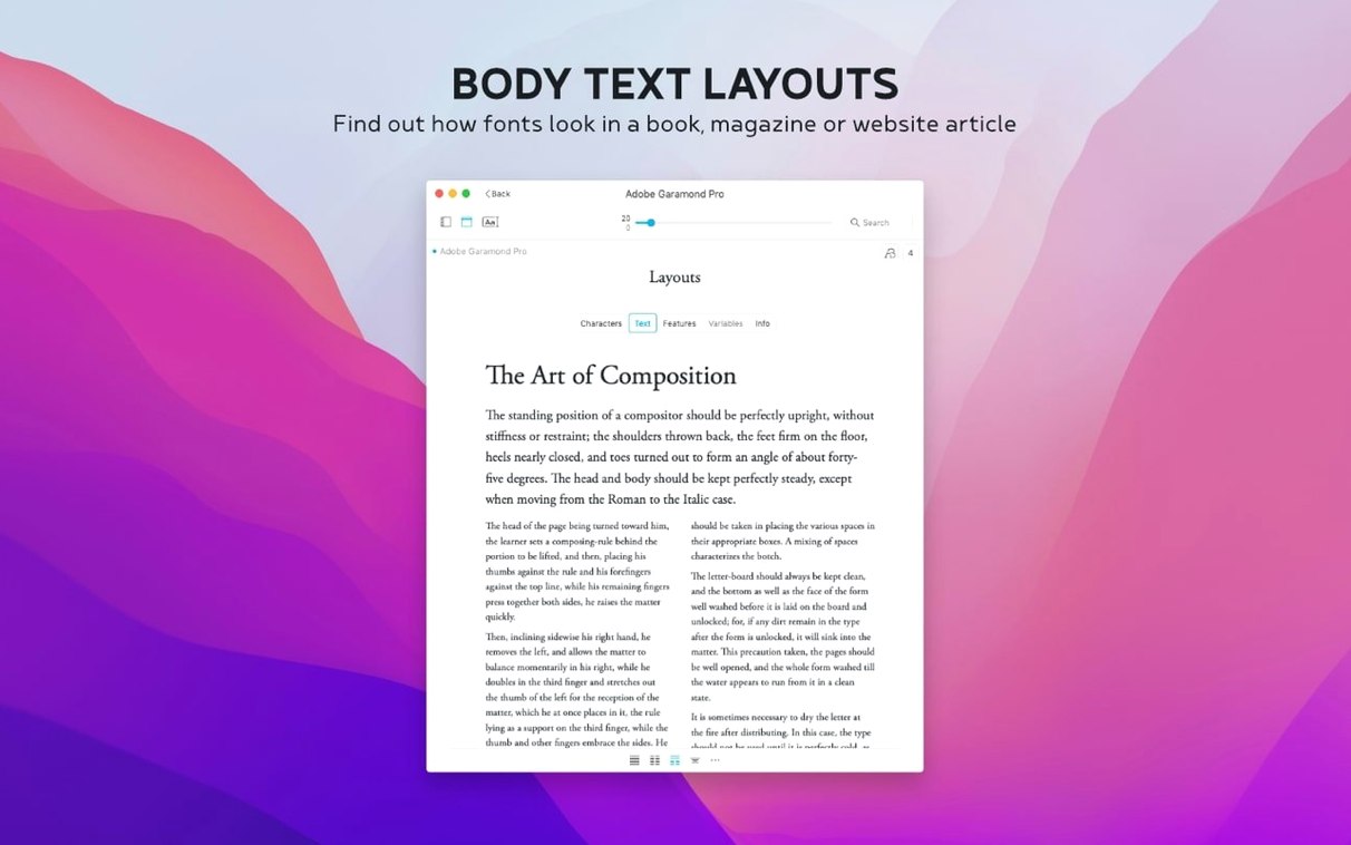
You know that moment in Apple’s Font Book where you just want to see a clean preview without clicking through twelve things? Typeface is the app that gets right to the point. It’s a standalone font manager from Floor Steeg built to show you what you actually have installed and help you make sense of it, whether those are system fonts or your own custom collection.
- See any font in custom sizes with your own sample text, weight, and effects.
- Tag a font into multiple groups instead of locking it into one folder.
- Compare a few fonts side by side to pick the right one for a project.
- Sort your collection by the last time you activated a font.
- Stash notes about a font right in the Info tab and search those notes later.
- Opens .otc font files along with everything else you throw at it.
It runs natively on both Apple Silicon and Intel Macs, and the interface speaks English, German, Dutch, French, Czech, or Japanese. If you’ve outgrown Font Book but don’t want a heavyweight library tool, this one sits comfortably in the middle.
A quick workflow: picking a heading font for a poster
Let’s say you’re mocking up an event poster and you need something punchy for the title. You don’t want to scroll through every font on your machine one by one. Here’s how I’d tackle it in Typeface.
- Type your poster’s headline into the preview field so every font shows that exact phrase.
- Set the size large — 72 points or more — because you care about how the weight looks at display sizes, not body text.
- If the project already has a palette in mind, pick a sample color for the preview so you’re comparing apples to apples.
- Open the family grouping view. This keeps Montserrat’s nine weights together instead of scattered across the list.
- Tag anything that catches your eye as “poster-candidate” so you can pull that group up later.
- Park three or four finalists in the side-by-side comparison panel. Flip between them, squint a little, and discard the ones where the lowercase “a” bugs you.
Once you land on a winner, open its Info tab and jot a couple of notes: where you used it, which weight worked best, maybe a reminder to pair it with a specific body face next time. Next year when you revisit the poster template, you’ll know exactly why you chose it.
Treating tags like single-category folders
The biggest one is treating tags like folders. You can give a font five tags — “serif,” “wedding-invite,” “client-approved,” “thin-weight,” and “maybe” — and it’ll show up in every one of those filtered views. Beginners sometimes create a single tag per font and miss the whole point.
Another trap is forgetting the preview text matters. If you leave it on “The quick brown fox,” you’re testing letter combinations that might never appear in your actual copy. Swap in real words — especially the ones with awkward pairs like “ff,” “fi,” or all-caps acronyms — before you commit to a choice.
One more: people import a few hundred Google Fonts in one go, then wonder why the overview feels noisy. Nothing wrong with pulling in the whole library, but take five minutes afterwards to tag the ones you actually recognize and might use. Future you will appreciate the cleanup.
Rescuing the newsletter’s heading fonts each month
Imagine someone who lays out a monthly newsletter for a local nonprofit. They’re not a full-time designer, but they care enough to want the headings to look intentional. Every month they open last month’s file, realize they used something random, and spend twenty minutes hunting for a better option.
In Typeface, they build a collection called “newsletter-safe.” It holds about a dozen fonts the nonprofit has approved — mostly readable serifs for body copy, a clean sans for pull quotes, and one slightly decorative face for event callouts. Tags like “body,” “accent,” and “donor-spotlight” make filtering instant. When the new issue’s content comes in, they type a few sample headings into the preview, flip through the “accent” group, and pick in under a minute. The Notes field holds little reminders like “use only at 18pt and above” or “pairs well with Crimson Text” so they’re not rediscovering the same thing every cycle.
It’s not a fancy setup. It’s just enough organization to stop font selection from eating the afternoon.
A Notes field now lives in the Info tab, and you can search across those notes from the main overview. There’s a fresh Last Activated column with sorting, plus the app now handles .otc font collections.
- macOS 12 or newer
- Apple Silicon or Intel processor
Questions I actually get
Can Typeface open .otc font collections?
Yes, version 4.5 added support for .otc files alongside all the other common font formats.
Does Typeface work with fonts I’ve installed myself?
Absolutely. It shows every font on your Mac, including custom ones you’ve added outside of the system defaults.
Notes from the tables 0
Sign in or pull up a chair to leave a note.
No notes on this one yet. They go up after I read them.
More from the Mac Apps page
The whole page Mac Apps 12 MB
Tuxera NTFS
2023.1
Mac Apps 12 MB
Tuxera NTFS
2023.1
 Mac Apps 111 MB
TunesKit iPhone Unlocker
2.7.0.16
Mac Apps 111 MB
TunesKit iPhone Unlocker
2.7.0.16
 Mac Apps 64 MB
Transmit
5.11.7
Mac Apps 64 MB
Transmit
5.11.7
 Mac Apps Updated 34 MB
Unclutter
2.2.18
Mac Apps Updated 34 MB
Unclutter
2.2.18
 Mac Apps Updated 14 MB
TouchDesigner
2025.31550
Mac Apps Updated 14 MB
TouchDesigner
2025.31550
 Mac Apps 615 MB
Vector Magic
1.20
Mac Apps 615 MB
Vector Magic
1.20
 Mac Apps 17 MB
Topaz Video AI
1.7.1
Mac Apps 17 MB
Topaz Video AI
1.7.1
 Mac Apps 1.6 GB